In this article, we’ll explore a scoring system for rating and comparing websites, we’ll visualize those ratings using infographics, and we’ll see what data and structure this method provides for reviewing websites.
How To Tell Whether A Website Is Junk
We are all reviewers. We review many websites every day without even realizing it. In fact, many of us are experts at it. We don’t realize it because the whole process occurs in moments.
That’s how it is. We use websites; we judge websites. Even if we don’t know we’re doing it, we make judgements about trustworthiness, credibility, competency, reliability, design and style within seconds of arriving on a Web page. After looking around, we also get a pretty good feel for the user experience and usability.
Further Reading on SmashingMag:
- Web Design Criticism: A How-To
- A Comprehensive Website Planning Guide
- 15 Essential Checks Before Launching Your Website
Consultancy Reviews
For many years, the agency I work for has conducted detailed reviews of its clients’ websites. As part of the consultancy process, we offer recommendations for any redesign or redevelopment work that is necessary.
Snap judgments may be useful and unavoidable, but when it comes to reviewing websites professionally, we need to be more organized and thorough, and we do this by using a review methodology. It also pays in both time and effort to be formulaic and consistent in our approach, because there are so many things to look at when considering a website.
To make this easier, we use a set of heuristics to score websites, along with a simple method to quickly visualize any weaknesses. I use a set of heuristics that I have worked with and edited and updated to suit the type of projects I work with, based on original work created by User Focus.
Heuristics

(Image: Rick S.)
A heuristic is just a fancy word for a measurement of something that can’t readily be quantified (i.e. when there are no actual numbers to judge whether item A is better or worse than item B). In a 100 meter sprint, the winner is easily identified by concrete data. In ice dancing, the contestants are judged based on a set of technical and artistic criteria, giving them a set of scores.
All That Glitters Is Not Gold
We might be swayed by something that looks good, but we all know that beauty is only skin deep. As with everything that glitters, the job of the reviewer is to poke about and see if they really have struck gold.
Conversely, some websites that are judged harshly for their graphic design are successful beyond measure — I’m looking at you, Amazon, eBay, Craigslist and even Google. These websites aren’t much to look at, but functionally speaking, they do their job well and have evolved over the years to precisely meet their customers’ needs.
As designers, we’re asked to redesign websites that generally are getting to look better and better. It’s getting to the point that we find ourselves questioning the need for a redesign at all. But usually the problems are not immediately obvious in the visuals, layout or code. Sometimes a website is just wrong for the client’s brand; or the experience of performing tasks on it is unpleasant. Sometimes, a website just doesn’t work.
You can’t tell by looking. You need to dig deeper by really using the website, setting yourself tasks and trying things out. Only then will you experience what is really going on. Realizing just how much rethinking, redesigning and redeveloping a website needs often takes a while.
Metrics For Success
The success of most websites can be measured by some metric, be it the number of sales, uploads, downloads, clicks, comments or sign-ups. But a website can be successful in sales and still have problems; for example, it might be successful because of excellent marketing, because of its offline reputation (as in the case of high-street brands) or from having cornered the market. That does not mean it is without problems. But many more websites have no quantifiable metrics by which we can determine how good or bad they actually are. Judging these websites is more difficult and requires a bit more leg work.
A Many-Layered Cake

(Image: Scheinwerfermann)
When reviewing a website in detail, we have to explore many layers, both on the surface and below, including the following:
- Task orientation and website functionality,
- Navigation and information architecture,
- Forms and data entry,
- Trust and credibility,
- Quality of writing and content,
- Search,
- Help, feedback and error tolerance,
- Page layout and visual/aesthetic design,
- Accessibility and technical design.
Taking these broad categories, we can devise a list of questions to explore each and get to the heart of the website. This formalizes the process and ensures that the same thought process can be repeated the next time. It also serves as a checklist, ensuring that nothing is forgotten. For example, when looking at the layout and visual design of a website, our questions could include these:
- Are standard elements (such as page titles, website navigation, page navigation and privacy policy) easy to locate?
- Is there a good balance between information density and white space?
- Does the website have a consistent and clearly recognizable look and feel that will engage users?
For accessibility, we could formulate questions such as these:
- Is the color contrast across the website enough to make all of the content accessible?
- Does the website work comfortably at lower resolutions (e.g. 1024 × 768 pixels)?
- Does the CSS validate with the W3C’s validation services?
Regarding the written copy, our questions could include:
- Are the pages simple to scan on screen? Are they broken up by headings and subheadings? Are the paragraphs short?
- Are acronyms and abbreviations defined when first used?
- Does the website favor maps, diagrams, graphs, flow charts and other visuals over long blocks of text?
Depth
Although relatively easy to conduct, a heuristic review is not quick to perform. However, we can decide just how much depth to go into and how many questions to ask in order to get a feel for the website. The more heuristic measures we use, the longer the process will take; the fewer we use, the less informative the results will be. It’s a matter of striking a balance between the time available and the quality of returns. Selecting heuristics that get to the heart of each category can significantly reduce the amount of effort you need to put in.
Devising A Scoring System
To get a yardstick score for each heuristic, a simple score can be given. For example, 0 points if it falls short of a metric, 1 point if it’s halfway there, and 2 points if it does the job. So, if acronyms or abbreviations are defined in some sections but not in others, then the heuristic would score only 1 point. If the website worked comfortably at 1024 × 768 pixels, then it would receive 2 points.
These points can be totalled across each category to give a quantifiable sense of what’s going on across the website, as shown here:

Totals of heuristic data across categories.
Visualization
Representing this data visually helps us quickly identify problem areas and makes it easier to compare websites.
Radar diagrams are perfect for this kind of analysis, because they give a recognizable shape based on the score. The more circular the radar, the more balanced the score; the spikier the radar, the more variation in the score. The size of the radar plot on the axes indicates the score percentage itself, showing good and bad areas, as seen in the examples below:

A radar plot showing a website that performs well across all heuristic categories.

A radar plot showing poor performance across all heuristic categories.

A radar plot showing a website that performs well in all areas but one.

A radar plot showing a website that performs poorly in all areas but one.
Competitor Reviews
By combining the heuristic results of different websites, we can create a visual comparison of competing websites in a market segment. This is particularly good for getting a feel for which websites fail and which succeed in certain respects. Analyzing multiple websites can, of course, take a lot of work, so stripping your heuristics down to the essentials is a good idea.
A Direct Comparison
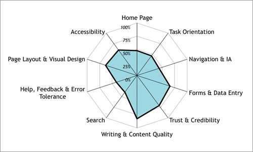
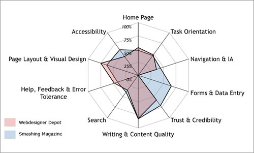
As a real-world example, below is a comparison of two similar websites: Smashing Magazine and Webdesigner Depot. We can see that both lack a little in most of the categories, apart from quality of writing and content, which is what we would expect from content-rich blogs. (Please note that I work for neither website and stand as an impartial bystander!)
Both websites score a little higher in page layout and visual design, but they have rather weak home pages, being in the format of a traditional, basic blog. Their calls to action score quite poorly (other than the advertising!). Smashing Magazine scores marginally better in navigation because it has the tabs on top to distinguish major content areas, whereas Webdesigner Depot almost loses the navigation below the advertising in the right-hand column. Smashing Magazine scores slightly higher in accessibility for a number of minor heuristics, such as the clarity of the text, spacing and contrast.
Webdesigner Depot falls behind a little on trust and credibility because of details such as the basic link to an email address in the footer (compared to the well-considered contact form on Smashing Magazine), and also for the very brief copy in the “About us” section. However, Webdesigner Depot picks up slightly more points in visual design for its colorful style. Of course, like the presentation scores in ice dancing, any process used to score aesthetics or design will always be subjective, so having a wide range of criteria for various aspects of design is a good idea.

A heuristic analysis of Smashing Magazine.

A heuristic analysis of Webdesigner Depot. Note that Webdesigner Depot does not really have or require form inputs, so it scores 0 by default in the “Forms and data entry” category; this score can be either ignored or removed altogether if so wished.
To emphasize the differences in the heuristic measurements, we can overlay one radar plot on the other:

Overlaying one radar diagram on the other to enhance visualization.
Conclusion
When reviewing a website, subjective snap judgements are unwise. We can do justice to a website only with a detailed test drive. We need to perform tasks and look in detail at various components on and below the surface. Heuristic scoring is a useful process for quantifying and visualizing a website’s quality when other measures are not appropriate or available. This formal process reveals problem areas, while focusing the discussion at the start of a redevelopment phase.
Resources
Based on work done by Userfocus. Discover more and download a free template to get started in creating your own heuristic reviews.
 (al)
(al)


