Games are becoming more Web-like, and the Web is becoming more game-like. If you need proof of this, you have only to look at Yahoo Answers. Random questions are posed, the top answer is chosen, and credibility points are given to the winner. It’s a ranking system that accumulates and unlocks more and more features within the system. It works because of the psychology of achievement and game mechanics and thus encourages interaction. This raises the question, what can a Web designer learn from games, or — more specifically — video games?
Further Reading on SmashingMag:
- Retro Video/DOS Games For The Weekend
- Using The Gamepad API In Web Games
- Playful UX Design: Building A Better Game
- How To Design A Mobile Game With HTML5
Good game interfaces have to be highly usable and intuitive, capable of handling a lot of repetitive actions in the fewest clicks possible. They need to be attractive and engaging. They need to be likeable. A good game interface adds to and enhances the user’s experience. In a game, people want the content delivered to them in a way that doesn’t break the fantasy. Any dissonance with the interface will cause an otherwise great game to fail.

Even in older games, as in Prince of Persia (displayed above), the limited system capabilities enforced designers to come up with creative and innovative design patterns. With more capabilities available today, we are able to find more advanced design techniques in modern video games.
In the same way, website users want their content delivered to them in a way that is easy to understand, intuitive and engaging and that doesn’t require a lot of scrolling or clicking. In fact, Web designers can learn a lot from video game interfaces. Websites that use common game interface tools can streamline the user experience while adding a lot of personality. This can result in higher traffic and a higher rate of repeat visits — and sales… Cha-ching!
It’s no surprise, then, that we’ve seen an influx of carousels, lightboxes, accordions and increasingly sophisticated navigation patterns, as CSS and JavaScript libraries have put such tools within reach of Web browsers. Whether it’s a good or a bad thing, is a topic for another article, and this article will focus on the techniques rather than their wrong applications.
What a Web designer can learn from video games isn’t limited to the user interface. Yahoo Answers works because of the psychology of the achievement system that is built in. So, while we will look at some basic user interface ideas and patterns, other higher-level concepts would be useful, too, and worth exploring.
Remember The Big Picture
In considering game interfaces, a Web designer needs to be acutely conscious of their project’s context and their client’s goals. Obviously, a website will often, though not always, have a goal that is very different from that of a video game. On many websites, efficiency needs to be a higher priority than entertainment. A cool fish-eye interface is not the most practical idea for a website dedicated to delivering tax information quickly or for an e-commerce website. However, an interactive social media channel might benefit from a leaderboard or some type of achievement system. Choose your UI components to fit the project.
Looking at the big picture, also consider structure and method — not just UI components. For example, look at how menus are structured, and consider why those choices were made. In many games, you have a hub-and-spoke type architecture, leading to different sets of tools within the menus. If you choose “Weapons,” then all of the options for weapons open on the next screen. You have to navigate back to the top screen in order to choose “Maps.” This structure simplifies a set of options that would otherwise quickly become confusing or overwhelming by providing focused attention on one choice at a time.
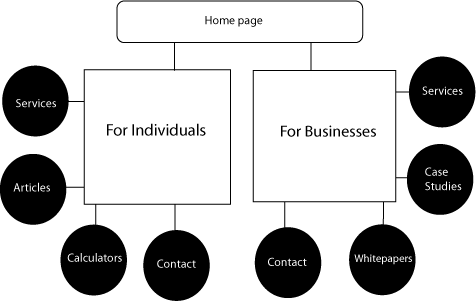
Can you see how this type of architecture could benefit a website that presents a large amount of information to the visitor? By allowing the visitor to focus on one piece of a large online task or one nugget of information at a time, you potentially increase the conversion rate for your client. This structure could also be effective when you are crafting a sales funnel on a website. The example below shows a simple game menu structure that could easily be applied to the information architecture of a website, building paths for visitors to follow.
If you were building a website for a CPA firm, you might segment its menu information under headings relevant to the type of visitor. A high-wealth individual has very different needs than a small business, but both might be interested in hiring the same firm. You could start at the top level, with two simple entry points serving as a funnel, one for individuals and families and the other for businesses and organizations, each button leading to the hub for that user. This hub page could provide content, offer pertinent tools and advertise relevant services for these very different users, thus simplifying their experience.
Also, notice places where video games show instead of tell, and try to understand how they do that. Successful games are particularly adept at showing during training sessions, in what are often referred to as “noob caves.” A character has to pass through elementary rooms or levels, where they are taught to accomplish basic tasks in a way that is entertaining and integrated with the story. An adventurer learns to pick up a sword and swing it, then kills a rat, then learns how to pick up treasure. The user is taught to use the interface through immersive experience.

In The Elder Scrolls IV: Oblivion, you start out in prison and must escape through an underground cave, fighting rats and the occasional small goblin along the way to learn the basic controls of the game.
Why is this relevant? You probably won’t have to make a full interactive tutorial for a complicated interface, but chances are your client’s content will be more clearly received and more quickly understood through intelligent graphics or charts. You could take big concepts and break them down into bite-sized chunks. You could look for potential points of confusion and clarify with tooltips or examples rather than long explanations. By studying how games show instead of tell, you could get a breakthrough on a thorny presentation problem.
Engagement Doesn’t Have to Be Glitzy
Game design wizard Jesse Schell says, “Games offer the possibility of success, the opportunity to satisfy your curiosity, the chance to do some problem-solving and make clear choices, giving a feeling of freedom.” Even the most mundane of websites could be made more engaging by asking the question, What elements of games do people find pleasurable?
Games provide clear feedback, often at the instant of user input. These elements could be incorporated into interfaces, and not only through carousels or accordions. Asking something as simple as “Would you like to learn more about this topic?” upon confirming the submission of a form can go a long way to increasing user interaction.
Some Web designers already implement some of these common UI components at a simple level. Certainly hover menus and tooltips are not new. Seeing how these are implemented in a game can spark ideas on how to implement ordinary UI elements in a more creative and interesting way.
Examples, Please
Let’s dive in and look at some UI elements that can add zing to your next project. We’ll look at some examples and then a few resources where you can learn more.
AJAX Messages With Loader Image
These loading screens from Fallout: New Vegas (top) and Fallout 3 (bottom) have helpful information and tips, along with a background image that expands on the theme of the game. Instead of a spinning loader image, the user sees a roulette wheel or green-screen target that transforms a boring wait into a fun part of the game experience.
What a Web designer can take from this:
Customize your graphics. Use them to pull the user into the “world” that you’re creating on screen. Even if you are working on a corporate website, you can load tips and helpful bits of information. Building a retail sports website? Perhaps you could use a spinning basketball for your loading graphic on a slideshow. Not sure how to get started? Check out this tutorial to learn how to preload content.
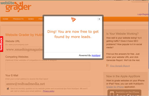
A full-page background image for a loading screen might be too slow, but you could add a colored background to the loading panel div, and then use JavaScript plug-ins to load random tips and information to fill the space. For best results, keep the loader files below 30 KB; the smaller the better. A simple AJAX call can grab tips every so many seconds, or you can simply post one for each load. The choice depends on how much content you need to load and how much time you have. For an example of this kind of loader, check out the Website Grader at HubSpot. After submitting a link, check out the loader that comes up as you wait for the result.
Custom Cursors

In Fable 3, the place being chosen by the user is indicated by a magnifying glass, which acts as a custom cursor.

In The Elder Scrolls IV: Oblivion, a simple hand cursor indicates an object that the player can pick up. A red hand indicates that the item is being stolen and that soldiers might pursue.
What a Web designer can take from this:
Probably the most recognizable custom cursor is the “grabby hand” Google Maps. But custom cursors are nothing new and are common in Web applications. The capability is built into most browsers.
It’s important to use these cursors sparingly: when offering help, to indicate clickable content, and to highlight important information. Does a particular piece of information absolutely need to be seen by visitors? Try this demo of a custom cursor (pictured below). Do you see how it could be used to grab attention and highlight important points? Imagine what a well-executed JavaScript magic wand could do on a children’s website to capture attention! Obviously, it wouldn’t be a good fit for a corporate website, though.
Icons, Icons, Icons
One big difference between video games and websites is that icons are used much more in complex game menus than in website navigation, and rightly so. A user typically spends much more time in a game than on a website. But icons are still used on websites, and increasingly so as the line between websites and Web applications blur.
So, how are icons used effectively in game navigation? They must be readable and fit the context. In the example above from Halo Reach, the user relies on icons to navigate and choose weapons, but the menus resemble a “heads-up display” (HUD) that we might see in a vehicle in the real world. In Oblivion, icons are presented on “scrolls.” Website icons should likewise be easy to understand. Add text labels for optimum usability.
Icons can greatly accelerate navigation through complex menus if the icons are carefully chosen and consistent and if users spend a lot of time on the website. Use solid-color, high-contrast outlines of easily recognizable shapes that are simple and quickly readable.
Games are moving away from small, highly detailed images to more sophisticated outlines (in smaller files), such as those found in Halo Reach and the Call of Duty series, and larger detailed images with distinctive shapes, such as the ones below. Even if you don’t notice the details, you will recognize the hand, circle and face outlines. Using the same color makes them less visually complicated and easier to decipher. The more icons that are used, the simpler and more quickly readable they should be.
You can also use icons as visual cues to focus attention on key topics. Use “header” graphics instead of buttons as quick prompts in content boxes and repeating topics to reinforce concepts. Make complex images bigger, and be consistent. Use icons to add interest to lists, and break up content into digestible pieces and to draw attention to important sections of text, as Treemo does so well. Consider using relevant icons for navigation and topical groupings. You could use consistent shapes as headings within the text or as pull quotes to indicate that certain content is related. Use icons to make content easy to scan, highlighting points of interest, so that users can quickly find pertinent information.
Icons don’t have to be static illustrations. The screenshots on Pattern Tap serve as traditional thumbnails, but their distinctive shape also functions as an icon, increasing interest and reinforcing the brand:
What about using your client’s own products as icons? The clever sub-menu on DonQ, shown below, uses the products themselves as icons, quickly and easily directing you to the one you’re interested in. Even more clever is the way that the rest of the content dims when the sub-menu appears, making your options stand out.
Full-Page Carousels
Tabbed screens that fade out, such as this one from Dragon Age, Origins, have been around for a long time:
In the “Carnage Report” in Halo Reach, below, this idea is taken to a new level. The screens scroll horizontally, and each page has multiple tabs. Gamers are used to this type of interface. But take it to the Web, and people will be surprised.
You have to interact with this type of interface to do it justice.
Jax Vineyards uses a similar type of layout, without tabs:
Add tabs to each carousel screen, and you would take this website to the next level.
Magento offers another, simpler take on this idea:
Right now we see this type of interface in mobile and tablet UIs in which there are multiple background images. We also see it in games of all types. This is more than tabs within tabs or simple horizontal scrolling: think iPad with multiple desktops. Think for a Living offers a (very game-like!) map in the top-right corner to help users navigate its unusual carousel.
What a Web designer can take from this:
If you have a lot of content, then this bold solution can be user-friendly and can increase engagement. Remember the good old on-page anchor tag with a target? This is the same concept in new clothing. Your screens slide in and are easily navigable with a touch screen, which is a factor that will only increase in importance.
Because of the various screen sizes, this type of layout requires careful planning and might call for CSS3 media queries to ensure that the content loads as intended on different screen sizes. You will need to make your layouts responsive. You can implement a full-screen carousel by using a page-sized div, with the overflow set to hidden, and placing the screens in an unordered list with a set width.
Users will become increasingly familiar and comfortable with this type of interface as they adopt tablets. Implementing an even simpler horizontal scroll can make your client stand out from the crowd.
Slider Menus
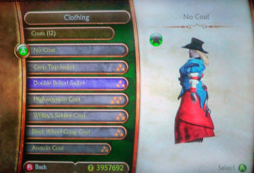
Fable 3 is out, and its immersive menu system is completely different from the one in Fable 2, pictured above. But Fable 2 has such a beautiful slider menu that we had to include it.
Scrolling with the slider reveals buttons, and content is presented on the right half of the screen. The buttons also have dropdowns under them. Inactive content dims. Pictured above is the top category of “Clothing.” Then the content drills down to “Coats,” then to specific clothing items. Does this remind you of e-commerce?
What a Web designer can take from this:
Have you ever been on a website that had huge fly-out menus that covered the page? And as you hovered over items, they expanded into sub-menus… four levels deep! Such complicated menus can be intimidating and make the person want to leave. Making the menu small, easy on the eyes and quickly scrollable is a great way to overcome bloat and keep visitors from clicking away.
There are already some slider scripts that provide custom scroll bars for any div container. Why not put buttons in the div? There may be certain settings (like entertainment or fashion websites) where this type of menu is more usable and scalable than your average dropdown or fly-out menu. Add an AJAX loader for your onClick event, and you have an engaging interface that users can easily decipher. The goal is to keep users on one screen while keeping the menus scalable. You could add literally as many items under each menu as you need without making them unwieldy.
Pivot Screens
I must admit, my heart skipped a beat the first time I saw the pivot screens on Halo Reach. When you get to the main menu, the text is skewed. Halo Reach uses perspective throughout the game to point to the right edge of menu screens. This is a visual cue. What happens when you push the controller to the right? The screen jumps and scrolls horizontally, blurring, to give you the next screen, which uses perspective as well, this time skewing all of the text and images to the left. Under a tab, your character is animated, barely moving and eerily life-like. Bravo. I sat and played with the pivots for a while. Of course, my first reaction was, I want to do that.
What a Web designer can take from this:
With a little Photoshop, you can emulate this menu. By using a large panoramic background image that covers two screens’ width with skewed CSS3 typography, and a fast horizontal scroll in JavaScript, you could get something close to the tilt found in this game.
Apply this to a smaller pane, and use it on a banner or button that is completely animated in two frames, and you’ll get a wow (so will your client). I haven’t seen anyone using this method on the Web yet, but I did work up a little demo to give you a starting point should you want to implement this yourself.
Also, notice the way that Halo Reach integrates mundane menu screens into the world of the game with the clever illusion of a landscape in the distance. It’s a beautiful thing. It gives a sense of depth and approach, like when you look at a city from a plane before landing. It builds excitement and entices you to go deeper, to interact and be part of the action. This type of integration does not lend itself to all website experiences, but it does to some; and when appropriate, it is worth doing. Never underestimate the power of delight.
Context Menus
The context menu in a video game is the kissing cousin of a website sub-menu. Context menus like the one above from Assassin’s Creed: Brotherhood give the user specific options depending on their location in the game and their choice of actions. If you choose to cast a spell, then the sub-menu offers you a fireball or lightning blast. If you choose to move, then you can run, climb or hide, all from the radial menu. Radial menus with icons are very popular, but context menus could just as easily be short vertical lists of text.
What a Web designer can take from this:
When you invite a user to take a specific action, a context menu can enhance the experience. Instead of providing lists of links, you could offer a fun array of specific actions to take. We see this used now in Web applications and in small social media sharing widgets.
When making a context menu, you might at least consider making it radial. Radial menus should give users a choice of three to eight options, and the interface can add visual interest. Keep the menus as simple and clear as possible. They should offer relevant choices to the user at the point of decision and increase conversion rates. They should also be easy to click and visually lightweight.
For a fun example of a radial context menu, check out TuneGlue’s musicmap:
While this was done in Flash, you could build a simple radial menu with JavaScript. Or you could get more complex, with nested radial menus, like so:

Radial menus aren’t limited to context menus. Pop-up panel menus at a point of action can be equally effective and may not take as much time or testing to develop.

Your Turn
Many other examples of great interface ideas can be gleaned from studying video games. Games offer design inspiration that can help you reward and gratify users and make your interfaces more intuitive and fun.
Are you building a website for a non-profit that is planning a donation drive? Consider using leaderboards to track donations. You could use leaderboards to give a shout out to the top 10 readers on your blog, giving them greater incentive to comment.
Study how icons are used, and think of ways to implement them that will make your website more user-friendly and enjoyable. Make interesting tooltips, or consider ways to add downloadable content (“DLC” for all you gamers out there) as a reward or incentive. By observing and implementing creatively, your websites will become more engaging and easier to use. And let’s not forget that doing the research is really fun!
Further Resources
- Introduction to Design Patterns A good beginner’s resource to learn about design patterns.
- Art of Game Design This book teaches the fundamentals of game design. Sample chapters are available to download.
- Interaction Design Pattern Library A great tool for brainstorming specific solutions to meet user needs. It has a list of patterns and detailed descriptions.
- Yahoo Design Pattern Library The mother of all design pattern libraries.
- Vertical Custom Scrollbars/Sliders A starting point for a vertical slider menu.
- Patternry A wonderful UI resource, with examples and how-to’s.
- Gamification And UX: Where Users Win Or Lose
 (al)
(al)


