In any industry where the people behind a company are as important as the company itself, you’re likely to find a kind of expanded “about” page that includes information on individual employees. “Meet the Team” pages are popular among web design and other creative firms, but are also found on sites within various other industries. These pages are a valuable addition to any site where human contact is an important part of the industry. It adds a personal touch to the company and can lend trust to visitors.
There’s suddenly faces behind the names, and it becomes a “real” company to the visitor, rather than just another website. This builds credibility for many, especially considering how concerned many people are with online scams and phishing schemes. Adding information to a website on a company’s key employees is a simple but effective way to make that company stand out in the mind of its prospective clients. Below are a handful of trends and some interesting examples of “Meet the Team” pages.
Further Reading on SmashingMag:
- Welcoming And Informative Introductions In Web Design
- Best Practices For Effective Design Of “About me”-Pages
- Stop Designing Pages And Start Designing Flows
- Web Design Elements: Examples And Best Practices
Trends
In reviewing “Meet the Team” pages, a few trends began to emerge. While some are present on almost every site (employee photos), others are used less often (animations). All were present on at least a handful of sites, though, and are worth mentioning.
1. Employee Photos
Virtually all of the pages included here have images associated with each employee. Most opt for photos of each employee, though some opt for avatars or other images to represent each person. This is a great way to let an employee’s personality shine through while keeping the design professional and consistent.
Object Adjective had a simple team page, with a photo and brief bio about each member, as well as their contact information and a link to their downloadable vCard.

2. Social Media Links
Considering how many professionals are likely to have LinkedIn, Twitter, or other social media accounts, linking to those accounts can be a great way to let current and potential clients connect with employees. Some of the pages featured include only professional accounts, while others include virtually any account the employee has. Some sites use icons for each social media service, while others use text, or a combination of the two.
A word of warning, though: if employee accounts are going to be linked to a professional website, make sure the content they’re posting on those sites is appropriate and won’t damage the company’s reputation.
Chromatic only includes profiles for their leadership team. They include a pic and brief bio of each team member, as well as links to their Twitter and LinkedIn profiles. Each team member also has their latest tweet featured next to their profile.
3. Unique, Humorous or Campy Features
A lot of the sites featured have unique, humorous or even campy takes on the more traditional “Meet the Team” format. For some, this is done through the employee photos, while others have added in additional content that lets team members better express themselves.
Be aware, though, of how this information can come across to professionals from different industries. What might be acceptable for a creative site might not go over so well in the finance or legal industries. It’s also important to consider how a site’s visitors will perceive a humorous or campy touch. While it adds personality, if overdone or done in the wrong industries, it can come across as unprofessional.
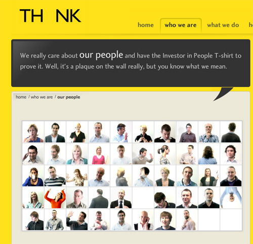
Th_nk used animated photos for each of their team members, and modal windows to display information about each team member.
4. Animations
A significant number of “Meet the Team” pages have incorporated some kind of animation into their designs. For most, this is done through employee photos or avatars, though some take it even further, with the entire page animated.
Ola Interactive Agency used an animated meet the team page, with each team member’s photo part of the animation. Click on a team member and their profile appears, including links to their Twitter and LinkedIn profiles, and their email. It’s a very casual, fun page design.

5. Expanded Profiles
While many sites opt to only include basic information about each of their team members, others opt to include extended profile information. For some, this is done through the use of sliders or modal windows, but for others it’s done on an entirely separate page. Extended profile information is a great way to give clients and prospects more insight into the employees behind a company.
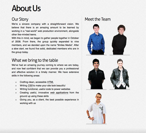
9miles Media uses photos of each of their members, which, when clicked on, display each person’s profile information, including links to social media accounts. It’s a simple but effective design.
More Examples
Below are twenty examples of great “Meet the Team” pages.
StationFour StationFour has a very clean and streamlined team page, though they inject a bit of personality by categorizing their employees as “The Chrises” and “The Non-Chrises”. They also include links to each employee’s LinkedIn profile, Twitter, and blog posts.
Efelle Media This is another simple team page, with a brief quote about each team member. Also included are links to each member’s full profile.
MW Design Interactive This is about as minimal as team pages get, with just a photo, name and title for each major member of the team.

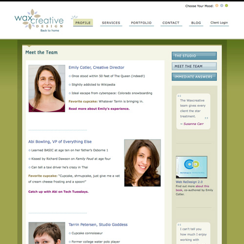
Wax Creative Design Wax Creative Design keeps each team member’s information organized with an unordered list, but also adds personality to their page by included each member’s favorite cupcake.
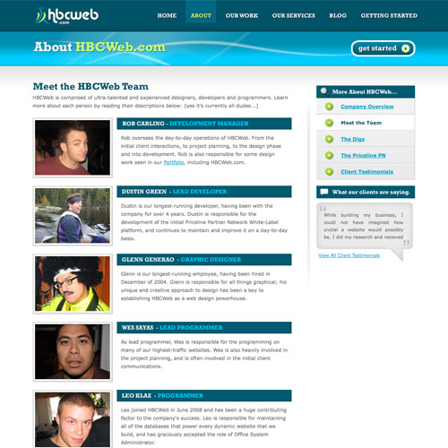
HBCWeb.com HBCWeb.com keeps their meet the team page casual, with candid photos of each team member as well as a brief bio of each.
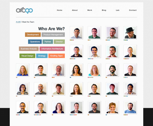
Arc90 Arc90 adds some punch to their meet the team page by having each team member’s photo change upon rollover from a straight-forward, business-casual-style pic to a candid shot. They also included a color-coded key for determining what each team member does.
Wildbit Wildbit shows only one (random) team member’s profile at a time under the list of team members. They also include links to each member’s Tumblr, Twitter, and Flickr profiles, if applicable.
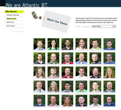
AtlanticBT AtlanticBT has a number of interesting features on their team page. Each employee has a photo that, upon hover, slides down to show their name and position. There’s also a drop-down menu at the top that lets you switch between their main photos, action figures, sports teams, movie posters, and favorite foods.
Blue Sky Resumes Blue Sky Resumes uses consistent photos for each of their team members, something that isn’t often seen. In addition to a bio for each team member, they also provide links to their Twitter and LinkedIn accounts.
MetaBroadcast MetaBroadcast uses a straight-forward and simple design, with icons for social media accounts for each of their team members.
2Cs Communications Ltd 2Cs shows photos of their team members just below the header, with low opacity except for the active profile. Images also come into full color when they’re hovered over. It’s a great way to manage a large team, while still giving everyone equal space.
glue Isobar glue Isobar uses animated pixel artwork for each of their team members and Top Trumps-style profiles appear for each when clicked on. It’s a really unique and fun design.
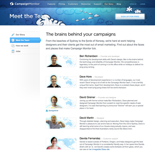
CampaignMonitor CampaignMonitor uses brief profiles for each team member, accompanied by photos of each. What sets them apart is that in the background of each photo is a map, showing the location of each employee.
WooThemes WooThemes uses a simple design that puts the focus on the founders of the company, but also gives plenty of space to the other team members. Links to Twitter and each team member’s blog are also included.
nGen Works nGen Works uses a simple avatar/name/campy title format, with a link to more in-depth profiles for each team member. It’s unique and fun while also maintaining a professional appearance.

BrightSpark BrightSpark uses a simple, one-column layout for their team page, with pics of each team member as well as a couple paragraphs about each.

Etsy Etsy takes a unique approach to their team page by putting different departments into separate columns, and displaying photos of each team member within that department. Each photo then links to more information about that employee. It’s a neat format, since it gives an immediate impression of how large each department is (the Engineering department gets 3 columns, and Support gets 2).
SmallBox SmallBox uses a simple grid of employee photos, each with the person’s name and title underneath. What sets them apart, though, are the individual team member profile pages. In addition to the usual bio information, they include each person’s top 5 strengths in “StrengthsFinder 2.0”. It’s an interesting and personal touch.
Caxiam Group Caxiam Group is another site where the individual team member profile pages are what make it stand out. On these pages you can find a keyword cluster that describes the team member, as tabs that give information on their inspriations hidden talents, unknown facts, and more.


