Companies spend thousands upon thousands of dollars every year in advertisement. Some companies even spend millions of dollars. Print advertisements take up a large portion of those advertising dollars.
There are different types of advertising techniques that these companies use in their campaigns. One such technique is to use a series of advertisements to promote a particular product or brand. Today, we will look at 10 clever and effective series of advertisements as well as the reason why I chose to include each of them.
You may also want to take a look at the following related posts:
- 60+ Amazing Poster and Advertisement Tutorials
- Online Advertising And Its Impact On Web Design
- Successful Strategies For Selling Ad Space On Low-Traffic Websites
A Closer Look at the Details
When I compiled these advertisements, I thoroughly observed them and looked for similarities in styles and presentation. I ran across a few common techniques that these ads employ in their designs. I would like to point them out to you.
- The majority of these ads are minimalistic. They are not overly busy or distracting.
- Most of the ads include one witty and smart tag-line.
- These ads are well thought out and use one clever image or photo-manipulation that will draw your attention.
- Most of the ads don’t throw their company logo in your face. Instead, they put it subtly in a corner where it doesn’t draw too much attention.
- These ads are all effective by themselves and they work even better when viewed along with the other ads that’s part of the series.
BMW
Caption: That’s why we don’t have front-wheel drives.
These series of ads are very clever. The caption fits the images perfectly. By the way, the photo-manipulation is precise. This is just a unique way of conveying the tag-line.
Coca Cola
Caption: Take the good side.
These ads all play off of the tagline, “Take the good side.” Witty copy-writing is the main focus of these ads. These ads are simple but very effective in grabbing the reader’s attention.


John Deere
These eye-catching ads are sure to grab your attention. The illustrations along with the bold statements go together perfectly. These are solid ads that are very appropriate for John Deere’s target audience.
Red Cross
There’s something about these simple and minimalistic ads that just attracts attention. Red Cross hits the jackpot with this advertising campaign. I really like the way they labeled their message by using labels. :)
Skinny Water
Caption: Incredibly light.
Another minimalistic ad that conveys its message with a simple tag-line and clever photo-manipulation. It seems like minimalistic is the style that most companies are going for in their advertisements.
Drugs
These ads are very powerful. They draw attention even without using a slogan or phrase. The picture speaks for itself. Remember the old saying, “A Picture is worth a thousand words.”
Greenpeace
Caption: Do you know what you eat?
I really like the way they portray danger by just using vegetables. This is yet another very minimalistic advertising campaign. The vignette background really ads a dramatic effect to these ads.
Red Wing Shoes
Caption: Make history.
Smart captions mixed with vintage pictures make these ads a real treat. By the way, the old, worn out images are perfect to use, since their tag-line is about making history.
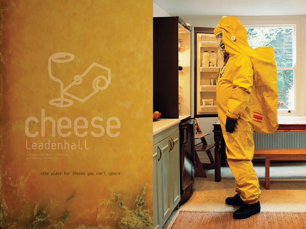
Cheese Leadenhall
Caption: The place for cheese you can’t ignore.
Very well-thought out ads. The cheese with the mold on it combined with the gas masks make for some unforgettable series of advertisements.
Adidas
All Day I Dream About Sneakers was a global branding project created for Adidas Originals. The project brought to life the world's most "original" range of sneakers, which we conceived, designed and directed into sculpted models. The full campaign extended into in-store posters, visual merchandising displays and a limited edition book.
These shoe ads are just two out of the many different variations that Adidas created. These unusual shoes definitely grab your attention the moment that you look at these posters. These unique shoe variations completely depicts their tag-lines, ‘Impossible Is Nothing’ and ‘Celebrate Originality’.
Which of these advertisements caught your attention? Which one is your favorite? What did you like about these ads? Do you think that using a series of advertisements works better than just one ad? Please let me know your thoughts. I’d love to hear your thoughts, comments, and criticisms so feel free to give us your two cents.Thank you for reading the article. You can follow the Design Informer on Twitter here.


