The time has come for the first showcase of music night club websites here on Smashing Magazine. We’ve scanned the Web up and down to find the most original and interesting online club identities. As usual, we have Flash websites and CSS eye candy. Please notice that the aim of the post was to showcase current web designs of music night clubs, so the gallery doesn’t necessarily showcase most usable or most beautiful night club web designs out there.
As we observed in the early Showcase of Fresh and Well-Designed Online Shops, the most obvious trend is the use of big bold pictures, either as backgrounds, headers or just side graphic elements thrown in the design mix. Most of them start playing music automatically (which is extremely annoying from the usability point of view), but in this case it’s not weird or off-putting because they are music club websites after all.
Further Reading on SmashingMag:
- 29 Brilliant Music Videos
- Add Music To Your Workflow To Improve Results
- Web Design Showcases From Various Industries
- Global Web Design Showcases
Another trend is the use of bright, vivid colors and intense color schemes, borrowed from the clubs themselves. Also, Flash clearly dominates in such web-sites, presenting some very unconventional navigation menus and very distinctive layouts that aren’t intuitive at all at the first glance.
Please feel free to use the comments area to suggest other club websites that you like.
Showcase Of Music Night Club Web Designs
Anzu Club Anzu radiates a great vibe that mixes fluid and electronic, with creative Flash and amazing usability.

Sass Vienna A simple yet visually rich website, with great transparency and light.

Bar Music Hall At first glance, this looks like a horizontal navigation-based website, but a closer look reveals that the only horizontal thing that moves is the header. A nice original way to keep it simple yet effective.

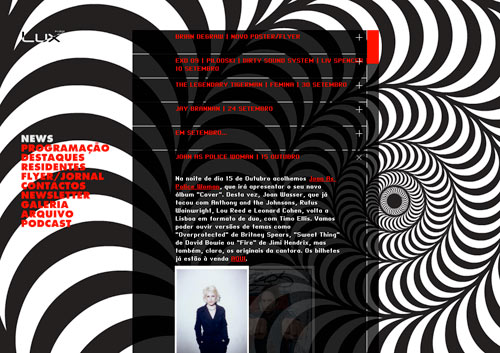
Lux Fragil Ever wondered what kind of website Alice (of Wonderland) would want for her club? Pretty much one like this.
Matter London A simple and effective design that uses the right colors.

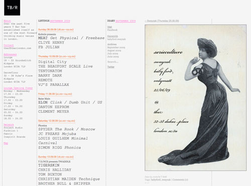
T Bar London Okay, this one is neither Flash nor the clean modern look, but it still looks classy without any fancy makeup. Just good old text (three columns) and images (one at a time).
Club Silo Prepare yourself for this one. Enjoy a full 3-D experience, with a cube-like menu put right in the middle of the club.

Blondie Bar This one is as cheap as it gets: static HTML with a flyer and embedded Tumblr blog. Not enough for a cool club? See for yourself.

Sugar Factory Some black and yellow awesomeness, with a lot of AJAX and nice blog integration.

Sub Club Minimal but definitely not simple, this one has the coolest menu in this entire showcase. Text at its best!

Macarena Club Don’t be fooled by the Latino-nostalgic name, we have a good-looking and really compact website here. The best part: fantastic player integration.

Favela Chic This one may be the only WordPress website in this roundup. A cool and efficient three-column theme. As visually random as the club itself.

Week End What if we could reduce a club website to its core feature: the schedule? We’d end up with this simple and beautiful calendar from the Week End club in Berlin.

Cube Club Very illustration-oriented, the Cube’s website must be the coolest entry by far for a CSS fan.

The Esplanade Also known as Espy, the Esplanade Hotel is one of the coolest live music venues in Melbourne and has a mesmerizing Flash website, with strong black and white graphics and beautifully crafted animations. I really like the cloud pre-loader.

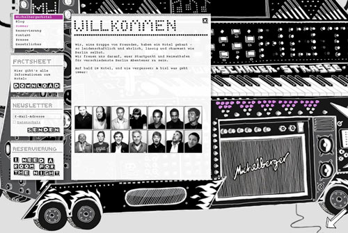
Michelberger Part website, part zillion-instrument club website, this one is a Web illustration masterpiece. You can turn some knobs on the remote in the lower-right corner.
Trouw A simple grungy blog website, with all the info you need stored in small post-like areas.

Paradiso The audio player look and feel of this website is truly fantastic. Just zap around.

Dice Club This one looks more like a fashion website than a club one because the header is huge and has nice photos of the staff.

Baalsaal Another full-screen Flash-based website, with a beautiful illustration in the background.

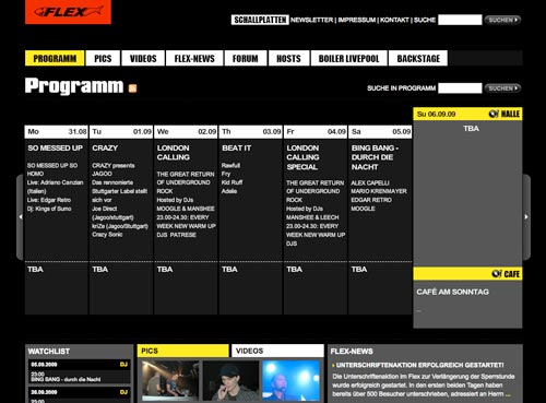
Flex This one has a practical, down-to-earth approach, but with some cool graphics as well. Highlights: the calendar-like design and grid-based multimedia archive.
Beta Nightclub The Apple Computer of club websites. Glossy and stylish, with a great navigation system.

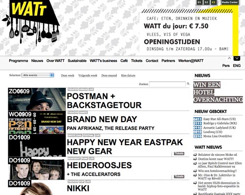
Watt Rotterdam Why didn’t I think of that? A full-width header that scrolls like a carousel makes this website look slick!
Residenz Lounge Cool flashy menu, and a good overall experience.

Barraca Amazingly seamless integration of large images and small widgets: audio player, live news feed, dynamic agenda, podcast and social media shortcuts.

Pacha Global Amazing Flash, with a dynamic menu and other interactive goodies.

Byblos What’s better for a club website than moving eye candy at full screen? Great execution and creative design.

Le General Nice communist propaganda design for Le General. You know why red is the color of choice!

Smart Bar Practically a one-page website, with buttons only for extra info, the Smart Bar website sports a few digital sticky notes with a very a fresh look.

Club Disco Another Flash production, this time in glossy-Matrix fashion.

Bourbon Street Great transparency and fake pop-up windows on this colorful Brazilian website.

Ministry of Sound The legendary MoS club has a slick website with a glossy but clean look.

We Love Music Great color scheme and some goofy illustration make for a simple but pleasant virtual trip to Ibiza.

Brica Bar Here we have cool Reservoir Dogs-like characters for menu items. The colored bubbles in the back are a great choice for this.

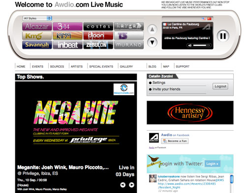
Bonus: Awdio Not really a club, but one of the biggest club-related achievements of the last years, Awdio is a jukebox that plays live music from the best clubs in the world. The layout is built around a Flash-based player that features various “stations” (live music venues).
 (al)
(al)


