Smashing Magazine has been on Twitter for about a year now (@smashingmag), and it turned out to be a great medium to communicate with our audience, build connections, discuss design-related topics and give away some nice prizes. However, even a year later, we still don’t have a Twitter background page and now is a good time to change that. So because we decided to create our own Twitter page, we wanted to first find out how other designers do it and what tips and techniques they use to create a truly outstanding, beautiful Twitter page.
You may want to take a look at the following related posts:
- 15 Useful Twitter Hacks and Plug-Ins For WordPress
- 8 Useful Tips To Become Successful With Twitter
- Twitter Icons: Cute Tweeters & Birdies
Your profile page is the only place on Twitter where you get opportunity to showcase your visual brand and possibly communicate additional information that can last longer than a tweet. You can customize your profile page by changing background, text and link colors. It’s as simple as changing the skin, but ability to change background image has allowed designers to create really unique profile pages.
Primary focus of this article is to explore various techniques to create unique, memorable and effective Twitter profile pages. However, before proceeding to the list, it is important to briefly discuss the structure of the Twitter profile page.
Twitter Profile Page
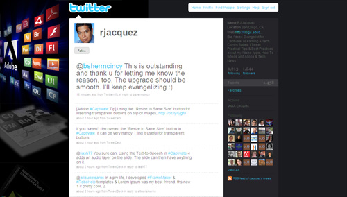
Most important thing to note is that the main content block in the layout of a Twitter profile page has the fixed width of 765 pixels, and it is always centered. This is good, because it makes it possible for you to show your background image using the extra space created on the both sides of the block when displayed at higher resolutions.
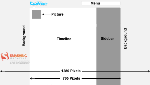

Other things that you should keep in mind:
- timeline background is always white
- menu bar background is always white
- footer bar background is always white
- logo is always the Twitter logo
- picture can be changed
- you can change text color, link color, sidebar background color and sidebar border color
- you can change background image and background color
- you can also tile background image
- the background image start position is always top left corner
Note that if you are only interested in designing a nice profile page, you can easily do that by incorporating a stunning background image and customizing text, link and sidebar colors accordingly. But if your intentions are to be unique, incorporate brand identity and communicate additional information, then you will need to be little bit more creative with your background image.
Tips & Techniques
Following is a list of profile pages, illustrating various tips & techniques that you can incorporate in your own backgrounds. Please note that most of these profile pages incorporate more than one technique, and you should also consider mixing multiple techniques according to your own requirements.
Merge Background With Timeline / Sidebar
This is probably the least used technique among all tips and techniques discussed here. By merging your background graphics with timeline and/or sidebar, you can create a unique layout with a very distinctive look and form.
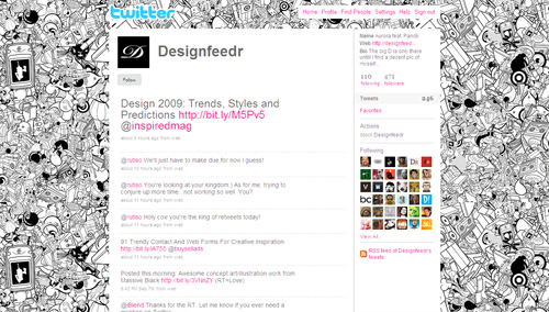
Mix Tiled Pattern With Other Graphics
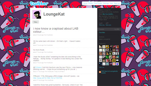
Twitter allows you to integrate one background image that can be either tiled or not. But you can create unique look for your profile page by creating a background image that has both.
@spurrachel


Reveal More With Your Pictures
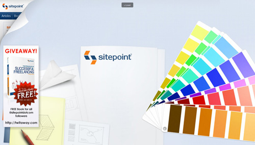
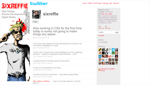
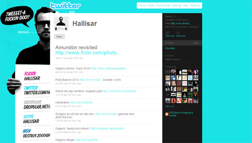
Your profile picture (it can be an avatar, logo or photo) is your main identity on Twitter; it will be displayed next to every tweet that you send out to your followers. For instance, you can use a background image that is somehow related to your profile picture and thus convey more information about yourself or your brand. In other words, you can use this classic approach of creating design around your logo or brand identity to communicate information in a more effective way.
Reveal More With The Page Peel Effect
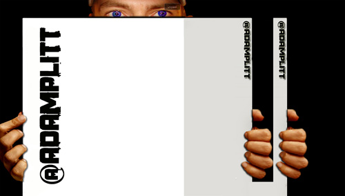
If you have an established visual identity, you can use page peel effect to show users who is actualy behind the Twitter profile. This technique provides you with a freedom to design the rest of the background as you wish, because you may no longer need to worry about integrating brand visuals and its colors.
Add Personalized Sidebar To Your Profile
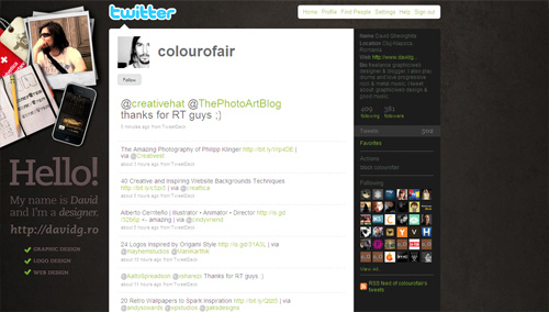
The following profiles illustrate a specific use of the first technique by adding sidebars to the layout. You can add such panels to effectively highlight additional information that you want to communicate.
Show Yourself
In social media world, you are the brand. With Twitter, being one of the major players in social media, showing yourself on the profile page can be very effective way of strengthening your brand and community around your website.
Use Icons and Logos
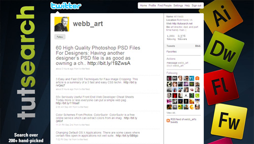
Following profiles illustrate simple, yet very effective technique to communicate association with or involvement in certain community, service, skill, etc by showcasing relevant icons or logos.
Add a Header Bar
Adding a header bar could be used for creating unique look for your profile page, but it can also be used to separate Twitter logo and top menu (which contain links to user’s profile) from the rest of your page.
Less is More
Andre Gide once said that “Art is a collaboration between God and the artist, and the less the artist does the better”. Here are few illustrations of how minimalism can be used to its full effect:
Accommodate the 1024px Width
If you care how your profile page will appear on 1024px wide screens, you will need to work near the top and left borders of your background image. Here is an example of how a nice visual design can be used properly for various screen resolutions:
Here is another interesting technique to ensure that your profile page has a very similar look on both 1024 and 1280px wide resolutions:
Use Typography
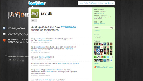
Use of typography in Twitter backgrounds is not very common; however if used creatively, you can create unique, very effective profile pages to communicate additional information.
Put Information In a Memorable Way
Composition is the plan, placement or arrangement of the elements. You can arrange elements on your background in a unique and memorable, showcasing information that is important to you and your readers. This techniques allows you to create an environment, show your personality and provide additional information.
Do Whatever You Want To Do
The more original, creative and distinctive your background image is, the more likely it is to be memorable and strengthen your online presence. Experiment with beautiful, personalized illustrations, background images and typography. Make sure that your background image has a personal voice, doesn’t look generic and has an unusual twist. Your first time visitors will appreciate it.
Gallery
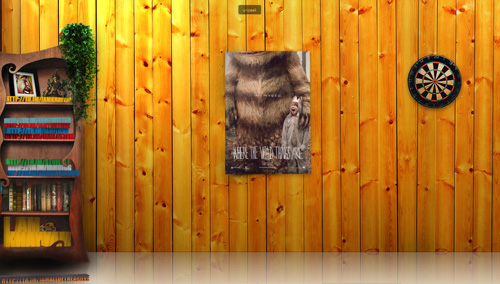
Now that we discussed a couple of techniques for the design of Twitter backgrounds, here is a collection of some well-designed profile pages to tame your appetite for Twitter profile page inspiration.
Tools
- Twitter Background Template: Free Twitter Background template in PSD format from “Fuel Your Creativity”, includes guides that match up with different resolutions from 800x600 to 1900x1200.
- Peekr: A bookmarklet that you can drag to your browser’s toolbar and click on to see a twitter user’s entire background graphic and then click again to get things back to normal.
- Twitter Background Checker: Lets you check how your Twitter profile looks in smaller or higher resolutions.
- ClickableNow: Add Clickable Links to your Twitter background image.
Additional Resources
- Twitter Background Design How-To and Best Practices
- Design a Unique Twitter Background
- 4 Ways to Optimize Your Twitter Background
- Resource Kit To Create, Customize & Find Twitter Backgrounds


