Interest in photography websites has exploded over the last 10 years, largely thanks to the developments in digital photography. Cameras and computers have become cheaper and more powerful, software more sophistocated and printers can now print photos that are as good (if not better) than anything produced in a chemical darkroom. Now, once you’ve acquired a digital setup, the economic restrictions of film and development costs have been removed and the cost of photography is virtually nil.
Along with these developments in photography has been the parallel development of the Web. Ten years ago websites were largely clumsy, HTML driven constructions. Today, contemporary photographers have powerful tools such as WordPress and DreamWeaver with which to develop their websites. Photographers can also sell their work through companies such as PhotoShelter or ImageKind, and through photo libraries such as Alamy and iStockPhoto, opening up new revenue streams.
The result is that photographers are finding new and exciting ways to showcase their best work online. We took a look at some of the beautiful photography websites that we could find, analyzing the design trends and the reasons why these websites work.
Further Reading on SmashingMag:
- 40 Amazing Online Photography Magazines
- 50 Incredible Photography Techniques and Tutorials
- 50 Excellent Digital Photography Photoshop Tutorials
- 25 Beautiful Macro Photography Shots
Photography Websites
Bottle Bell Photography The graphic design of this website perfectly complements the fantasy world of the photographer’s vision.

Daniel Kennedy Photography Top class professional photography presented in a simple to navigate, beautiful website.

East Photographic An unusual site because it belongs to an agency rather than a single photographer.

Jason Bell The website of world renown celebrity photographer Jason Bell. Yes, that’s Mickey Rourke on the front page.

Jeffery Salter Simple and effective design.

Jill Greenberg A beautiful website from a master photographer. The photos are big, bold and colourful.

Jonathan Glynn Smith A dramatic splash screen and beautifully minimalist design.

Kim Mendoza This website shows off the work of social photographer Kim Mendoza. The music is a nice touch, what visitor fail to be convinced of this photographer’s talent?

Levon Biss All the drama and explosive action of sports photography.

Rankin A bold and colourful design from one of the UK’s foremost fashion and editorial photographers.

Steve McCurry The warm colours of this website are unusual, and make the website stand out.

Timothy Hogan This website expands to a full screen to show off the photographer’s photos.

Lara Jade A beautifully designed flash based website.

Brent Stirton Photojournalist Brent Stirton’s website grabs you on the first page with a fast moving slideshow of some his most dramatic and hard hitting images.

Burn Magazine Burn magazine uses a blog-like design to keep the lastest content fresh on the page. It uses a dark gray background to emphasise the site’s logo, displayed prominantly at the top, and a large photo to introduce the lead story.

Gavin Gough Gavin Gough is a travel photographer currently living in Thailand. His website is a brilliant example of self-promotion. The front page has a small flash movie at the top and a large photo underneath. Dig deeper into the website and there are photo galleries showing only his best work, a blog for personal anecdotes and tutorials, and a stock photo gallery hosted by PhotoShelter.

Timothy Allen Timothy Allen’s website is a WordPress powered blog, slightly corporate in nature as it’s put together in conjunction with the BBC. The design is very effective, there is a fast moving slideshow at the top of the front page, and below that, a moving strip of thumbnails that are links to the latest articles. The latest article is published underneath, and at the bottom five short columns display links to articles on Photography, Travel, Video, Tutorials and My Musings. The front page is designed to wow the visitor and provide easy to follow links to all the interesting content within the website.

Mitchell Kanashkevich A beautiful website, the reader is in no doubt that the website belongs to a travel photographer. Navigation is clear and simple and the photo galleries are stunning. The photographer has a small collection of his best photos. This is very important, because the quality of a portfolio is often judged by the weakest shot.

Bruce Percy A very simple design that leaves the viewer no doubt what he’s seeing. A quick glance is enough to see what the photographer does. Navigation again clear and simple. The black background works well with the minimalist design.

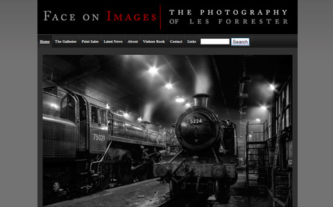
Face On Images Photographer Les Forrester’s website is a masterpiece of simple design. The colour scheme of dark grays and blacks, with typography in gray, white and red is very effective. A moving slide show shows off some of his best photos on the front page, along with a nice introduction and the latest news.

Your Beautiful Photography Once you get past the splash page the simplicity and beauty of this website becomes apparent. The photos dominate, presented against a simple white background.

Pablo Corral Vega Pablo Corral Vega is an established, well known photojournalist and his website reflects the quality of his work. Note the simplicity of the opening page design, a stunning photo at the top, the photographer’s name above, and more links below.

Colin Prior Simple design from Colin Prior, a British landscape photographer. A simple to navigate menu bar, an abstract photo that makes the perfect backdrop for some text, and below some inviting images that draw the visitor into the different parts of the website.

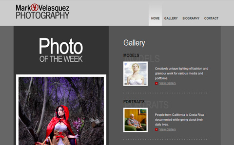
Mark Velasquez Mark Velasquez’s website features imaginative, colourful photography, presented in a series of easy to navigate photo galleries. One reason I like the photo gallery layout because it’s easy to navigate, the photos are relatively small and quick to load, and the photos are presented against a neutral gray background.

Jeremy Cowart Sometimes, a pro photographer just needs a fantastic looking website that displays photos and little else. SEO and speed aren’t priorities, because the url will be given to potential clients. The important thing is to wow the viewer. That’s what Jeremy Cowart’s website does.

Paolo Boccardi A big photo on the front page, easy to navigate links (I really like the little windows that pop up when you mouseover the links) and then horizontal photo galleries. Lovely!

Anna Kuperberg Photography A beautiful flash driven website. Excellent photography, a front page slideshow to show off the work, and a music soundtrack that seduces the viewer. A very professional design.

Vincent Laforet Open with a bang! Vincent Laforet’s website opens with his video Reverie, a video which created so much excitement amongst the photography world that it was downloaded over 1.5 million times the first 10 days it was online.

Chase Jarvis Chase Jarvis is famous amongst photographers for his blog, but his website is a masterpiece of web design. The viewer is greeted by a large, dramatic, slideshow on the front page, and an easy to navigate menu. The portfolio pages are spectacular, and the flash based design looks great.

Stefan Soell Another horizontal photo gallery, this one is interesting because the gallery is contained within a frame. Frames are a little outdated, but the advantage here is that the viewer can switch between portfolios without leaving the front page. The photographer sells fine art prints and books through the site, and the viewer is left in no doubt that he’s an expert in his craft.

Amy Deputy Photography Another flash based website, beautiful in its simplicity. The front page consists of four simple square images, link text and the photographer’s name and logo. The soft pastel colours of the photos on the front page complement each other. The website is also supported with a blog. Note the high quality of the portfolios. The website makes it clear that the photographer operates at the high end of the market.

Jessica Hilltout Fine art photographer Jessica Hilltout’s website has a very nicely designed front page, organising her work into three themes. Her name’s displayed along the top, and the categories along the bottom. A very simple, but effective website.

Chris Phelps A bold, graphic image on the front page, complemented by a simple navigation and design. A very effective portfolio presentation. All supported by a blog. Nice, very nice.

Isabelle Ribeiro Photography There’s a lot to like about this website; a strong, simple front page slideshow, beautifully presented photo galleries, and a blog!

John Wright Fashion photographer John Wright’s front page is a masterpiece of minimalist design. Not having a photo on the front page is a very bold move. Like many pro photographers, download speed is sacrificed for effect with a flash based website. The moving thumbnails on the portfolio pages are a wonderful touch.

Last Click
Andrew F Photography Another masterpiece of Flash web design from a pro photographer. The opening photos are stunning, and I love the way they float up and down. The photo galleries are a joy to navigate and view.

Trends In Photography Websites
- Blogs. The best are entertaining and informative, establishing the photographer’s expertise and building a relationship of trust and credibility with potential clients.
- Teaching. Photographers are passing on their knowledge and experience to beginners and enthusiasts.
- Selling. Photographers are promoting themselves and their work. Some stock photographers sell their photos through their websites rather than the big agencies.
- Workshops. Many established photographers earn money by teaching, and promote their workshops on their websites.
- Social networking. Many photographers have a page on Facebook, or a Flickr or Twitter account.
- HUGE photos. Photography websites are naturally dominated by images. A recent trend is to display large photos for maximum impact.
- Sophisticated design. Photographers are visual artists and need the design of their websites to reflect this. Good design often works in the background by making websites quick to load, easy to navigate and search engine friendly.
- Content over design. No matter how good the design, content is king. It may look pretty, but if it doesn’t inform and entertain, your visitors won’t return. Some of the most popular photography websites are nothing more than a free Blogger blog.


