From a web designer’s perspective, it can be very interesting to look at the top websites from a particular industry to see how they relate to their target audience, the different approaches that are used, and how they compare to websites in other industries. The fashion industry consists of companies that make their mark by designing beautiful and stylish items, and by setting trends for consumers, so one could expect to see some creativity and a focus on appearance in terms of their websites also.
In this article we’ll take a look at the websites of leading fashion companies, as well as some fashion news sites, and see when fashion, style and web design come together.
You may also be interested in the following related posts:
- Fashion Websites: Trends, Showcase, Interviews
- 70 Beauty-Retouching Photoshop Tutorials
- Finding Inspiration in Uncommon Sources: 12 Places to Look
Trends
As you browse through the sites that are showcased below, you’ll see some variety, but you will also notice the presence of certain trends. Here is a brief look at a few of them.
Large Photos
Naturally, and industry that is very dependent on image will make heavy use of photos and models. Many of the sites use large background images, some will use a slideshow type of approach to feature multiple photos. Going a step further from photos, some of the sites use large video areas on the homepage.
Black and White
Black, white and gray color schemes are very popular among the sites showcased here. Simple color schemes are capable of creating an elegant look, plus with so many colorful photos it helps to keep focus on the products rather than on other design elements.
Minimal Content on Homepage
There are a few different types of sites showcased here. Most are sites that belong to a particular designer or fashion brand, while other are fashion news sites. Those that are news sites will obviously include a larger amount of content, which means a homepage that can be very involved. However, looking at the sites that represent a designer or a brand, you will see that the majority have very little content on the homepage. In some cases the homepage is nothing more than a large photo and a navigation menu.
Fashion Website Showcase:
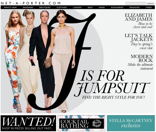
Net-a-Porter Net-a-porter focuses on fashion-related photos, a magazine-style look and a simple navigation without unnecessary Flash-effects. The result is usable and still beautiful (submitted by Andrew E in comments).
Prada Prada’s homepage includes only a large background image and navigation.
Paul Smith Paul Smith’s homepage includes navigation and a large background image that slides/scrolls from one to the next.
Pepe Jeans The website of Pepe Jeans uses a white, black and gray color scheme. The homepage includes a large photo that the user can change.

Aquascutum Aquascutum uses a simple layout, minimal style and a large image. The homepage is clutter-free and includes little content.
Free People Free People’s website has received a lot of attention from design galleries. The clothing boutiques site uses hand-drawn and grunge styles.
The Sak The Sak also uses hand-drawn elements in its design. The site uses a light color scheme.
Ralph Lauren Ralph Lauren’s US site uses a white background with a lot of bright colors.
Ralph Lauren Rugby Ralph Lauren’s Rugby website has a vintage background, a lot of color, and a video playing on the homepage.
Armani Exchange Armani Exchange’s homepage features a large photo, with black, white, gray, and small amounts of blue in the color scheme.
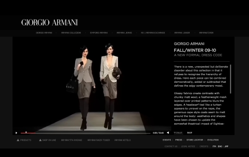
Giorgio Armani Giorgio Armani’s website is very dark and contains a large video of runway models.
ASOS ASOS’s website has a black background with a white content area. The homepage features a large photo and showcases certain product lines to the right of the layout.
Liz Claiborne New York Liz Clairborne New York uses a very simple and clean layout. The homepage consists mostly of a large photo, and secondary pages are also clean.
Mulberry Mulberry’s homepage includes only a logo, navigation, and a large photo area that fades from one to the next.
Hugo Boss Hugo Boss with minimalism at its best: the site has a very simple and calm design with a large photo area. Flash-based.
Issey Miyake Pleats Please Very simple, yet compelling design that strongly focuses users’ attention on the products. Flash-based. The Japanese version of the site tries to achieve the same aim with a more interactive approach (via @litherland on Twitter).
Lacoste A very dynamic and interactive site that not only showcases available products, but also tries to entertain users. And it works! Flash-based, music-autoplay included.

BCBGMAXAZRIA BCBGMAXAZRIA’s website showcases and sells their products. The site uses a gray background and the homepage currently features new styles for the spring.
Calvin Klein Calvin Klein’s website uses light colors and an un-cluttered layout.
Gucci Gucci’s website has a brown background. The homepage includes navigation and a large photo area.

Agnes B. Agnes B. uses an interesting layout with a large background and a lot of black, white, and gray.
J. Crew J. Crew’s homepage includes some promotions of current seasonal styles. The site uses a white and gray color scheme, but the homepage includes some blue and orange.

Sean John Sean John uses a dark color scheme with a gray background, and a sliding content area that the user can control.
Tommy Hilfiger Tommy Hilfiger’s site has a white background. The homepage includes some photos that allow for user interactivity on hover and by sliding.
Louis Vuitton Louis Vuitton’s homepage has a large background image with links to sites for specific countries.
Lucky Brand Lucky Brand has a colorful homepage with a large photo and prominent navigation to shop men’s or women’s styles.
Oilily Oilily’s homepage has a video area surrounded by purple covered with colorful floral decorations.

United Colors of Benetton United Colors of Benetton has a very bright and colorful website that sits on a white and gray background.
A.P.C. A.P.C.’s homepage uses a black and white color scheme with a large photo and hand-drawn fonts. The homepage includes links to the online stores for various countries.
Net-A-Porter Net-A-Porter’s homepage includes a very large photo with promotional links to some specific products.
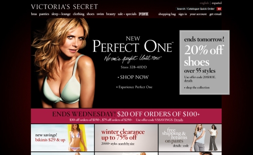
Victoria’s Secret Victoria’s Secret’s homepage currently uses a very dark red background, but the rest of the site has a white background.
DailyCandy DailyCandy includes fashion-related content among other topics. The site uses a white background and a lot of hand-drawn elements.
Dolce & Gabbana The top of Dolce & Gabbana’s website uses three photos as part of the navigation. The lower section of the page includes navigation to specific collections and products with horizontal scrolling.
The Cut The Cut is a fashion blog on New York Magazine. The color scheme is black and white with some splashes of pink and blue. The layout presents the blog in an attractive magazine/news style.
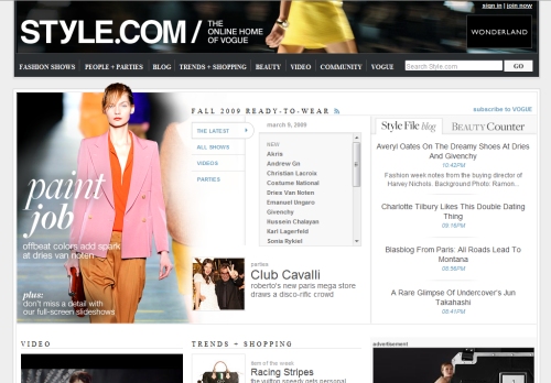
Style.com Style.com is a large fashion news website from Cande Nast, and the home of Vogue. With huge amounts of content on the site, it’s still easy on the eyes.
Kineda Kineda’s dark design is simple, yet beautiful.
Elle Fashion magazine Elle’s website has a news-style layout, with the homepage featuring a lot of content. The color scheme is black, white, gray and red with photos adding plenty of color.
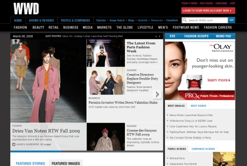
WWD WWD is a news-style website that includes fashion-related content. The site has a dark color scheme with a lot of colorful photos included.
Bazaar Harper’s Bazaar is a leading fashion magazine. The website uses a black, white and red color scheme. The layout is fairly typical of a magazine or news site.
Glamour Glamour Magazine’s website has a white background with a lot of color from photos and images.
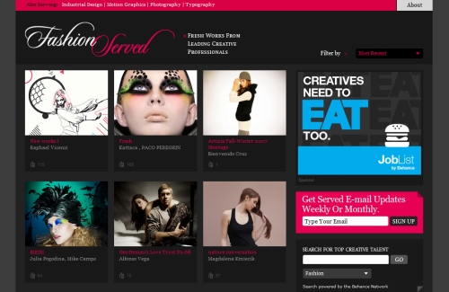
Fashion Served Fashion Served is fashion inspiration site from the Behance Network. The layout is gallery style.


