If you want to maximize the revenue of your service you need to maximize completion rates of your web forms. Unless you have some revolutionary ideas to impress your visitors at first glance, it is not enough to merely enable users to sign up on your site. To make it possible for the service to reach a maximal exposure we, designers, need to provide users with a good user experience. We need to invite them, describe to them how the service works, explain to them why they should fill in the form and suggests the benefits they’ll get in return. And, of course, we should also make it extremely easy for them to participate.
However, designing effective web forms isn’t easy. And it has one simple reason: nobody likes to fill in forms — neither offline nor online. Therefore, as designers, we need to figure out sound design decisions to make the form completion easy, intuitive and painless.
But how exactly can we understand these decisions? Where should the link to the form be placed in the layout? How should we design it? How should we highlight the labels and how should we align them? How do web form design patterns look like in modern websites? These were precisely the questions we’ve asked ourselves. And to get the answers we’ve conducted a survey.
Below we present findings of our survey of current web form design patterns — the results of an analysis of 100 popular websites where web-forms (should) matter. We have decided to start with sign-up forms first. We present the first part of our findings below; the second part of the survey results will be published next week.
Update: the second part of the survey results is now also published: Web Form Design Patterns: Sign-Up Forms Part 2.
Sign-Up Form Design Survey
The main objective of the survey was to provide designers and developers with some intuition of how effective web forms are designed in practice; we also wanted to present some guidelines of how a user-friendly web form can be achieved.
We have selected 100 large sites where web-forms (should) matter. To select these sites we have considered Technorati, Alexa as well as popularity in search engines and various rankings. We used this popularity as an indicator for sites where web forms matter as they directly affect business goals and therefore should have been given a high priority during the design process. In particular, registration forms are crucial for social applications that explain why many of the reviewed forms are from social networking sites.
We have focused on sign-up forms as we wanted to consider further crucial forms (e.g. checkout forms) separately. Afterward, we’ve gone through each and every one sign-up form of the selected sites and analyzed the design approaches implemented in these forms.
We have filled in each of these forms using a special e-mail account and a special user name. To make the survey as comprehensive as possible, we have identified 29 different design problems and questions which may arise when designing web forms.
We have grouped them in categories and attempted to find similarities in design decisions and design ideas. Trying to approach the problem from the usability point of view we have also kept notice of both positive and negative examples to showcase them in this article among our findings.
Please notice that this post is not about checkout forms — that’s a topic for another discussion, we may consider them separately in one of the upcoming posts. We would like to thank Wufoo for providing us with a framework to conduct our survey.
1. Placement of the forms
1.1. How is the link to the sign-up form titled?
Users know that they are supposed to sign-up, register, join, become a member or create an account which is why they are looking for exactly these phrases when they want to participate. Obviously, users expect that a link with one of these links leads to a sign-up form. Unfortunately, that’s not always the case.

The most popular title was “Sign up” (40%), followed by “Join” (18%), “Register” (18%) and “Create account” (17%). We have observed less large, loud and clear “start here”-buttons as we’ve seen them over the last years. Apparently, designers try to communicate information rather than design and emphasize the functionality of the service.
1.2. Where is the link to the sign-up form placed?
When users are visiting a site for the first time, they try to figure out what single layout blocks stand for. The eye movements are jumping “all over the place” and users try to understand which areas are more important and where the content he or she is looking for is probably placed. To meet users’ expectations designers need to help users to intuitively anticipate what is required to start using the service.
If the user can’t find the link that leads to a sign-up form, he also won’t be able to sign up for your service. Therefore, it is crucial to make the link as visible and as obvious as possible. Where should a designer place the “sign-up”-link to make it more approachable?
According to our survey, the sign-up link
- is placed in the header on 59% of the sites (76% of them have a “sign-up”-link placed at the right upper corner),
- has a prominent position on the homepage on 21% of the sites (link or the form itself is placed on the homepage)
- is hidden behind the “Login”-link in the header in 9% of the cases (e.g. Craigslist).
Not that surprising is the fact that the sign-up link was rarely placed in the sidebar (7% - Xing). However, 4% of the sites first offered users to directly use the service and required a registration only when it was required to store the settings.
2. Form Design
2.1. Is the sign-up form layout simplified?
Since the user has clicked on the sign-up-link he is likely to have decided to sign up for the service you are offering. More importantly, he has not clicked on the link to explore further navigation options or attractive blinking advertisements.
Consequently, designers tend to remove all unnecessary details and distractions which don’t help the user to complete the form. Often only a logo and the form itself are presented, without any navigation options or additional information. Idea: the user must be able to focus on the task he has to accomplish. Any distractions stand in user’s way and therefore have to be removed.

Since users want what lies on the other side of a form the process of completing forms should be as obvious and as simple as possible. Hence designers often use “minimized” layouts for sign-up forms. According to our survey, 61% of web forms are simplified compared to the general page layout, (e.g. Livejournal, Amazon, Yandex.ru).

Consider the sign-up form on Yahoo. The visitors are provided only with the form which is required to set up an account. There is nothing else; consequently, there are no distractions as well. Notice that the tone and the language are conversational and appealing. That’s simple, easy and user-friendly.


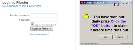
Flixster is probably our favorite example of an overcrowded form which doesn’t really respect its visitors. The registration page offers every possible navigation option at once. And the login page has outstanding advertisements right next to the login form. That’s not user-friendly. The second busiest web form we’ve seen would be Photobucket.
2.2. Is any additional information provided?
Many designers try to encourage visitors to actually fill in the form by presenting additional information such as help, required information or even copyright disclaimer. It differs from sites to sites; however, in most cases benefits of registration are presented next to the form.
- 41% of the forms provide benefits of the registration (MySpace, Del.icio.us, LinkedIn, Digg, Break.com)
- 28% don’t provide any additional information at all and offer a pure sign-up form (DeviantArt, Dailymotion)
- 11% inform the visitors how much time investment is required (Threadless, Newsvine, Wordpress)
Only few sites mention up front what information is needed during the registration (6%), which steps to follow (8%) or provide some warnings, hints etc. (6%, e.g. 37signals).
2.3. One-page-form vs. multi-page form
93% of the forms of the survey turned out to be one-page-forms. Apparently, designers try help users to get the signing procedure as quickly and painlessly as possible. Few sites using multi-page forms often try to combine signing-up with exploring users’ preferences.
For instance, Meebo combines a sign-up form with a complete registration and offers users a sign-up wizard in a pop-up window. The form consists of 6 pages where users are lead from setting their account to providing additional details about their preferences.

2.4. How are titles of the input fields highlighted?
62% of the sign-up forms used bold to highlight the title of the input field. It’s remarkable that not a single site used italics to achieve the same effect. To make the labels more visible 20% of sign-up forms used color and 18% used plain text.

Large version
2.5. Label alignment
To be honest, we have expected a stronger trend toward one of the possible alignments. However, in our opinion no strong trend in the label alignment can be identified.
- right-aligned labels are used on 41% of the reviewed sites (YouTube, Facebook, Metacafe)
- 30% of sign-up forms use top-aligned labels (Behance.net, Wufoo, Tickspot, Mixx, DZone)
- 29% use left-aligned labels (Digg, Ning, Wykop.pl, 43things, StudiVZ).

According to Matteo Penzo’s label placement research (1996) and Luke Wroblewski’s findings (pdf), top-aligned labels can dramatically reduce completion times since they require less eye fixations. If you want to achieve the same aim but have a vertical screen real estate constraints, right-aligned labels work better. And in case your form requires people to scan labels to learn what’s required (unfamiliar or advanced data), left-aligned labels work best.
2.6. How many mandatory fields?
When conducting a survey we’ve observed a strong trend toward forms with very few mandatory fields. Few years ago designers asked visitors to type in their personal information such as first name, last name, address, country and personal interests. Now login, password and password confirmation suffice.

We found out that 54% of the forms required the user to fill at most 5 input fields (in 6% of the cases registration wasn’t required at all to start using the service). 34% of the forms use 6-8 input fields, while 12% risk user’s patience with over 9 mandatory input fields.
2.7. How many optional fields?
Similarly to above findings one can observe that most sites avoid optional fields and ask users to provide the optional information after the registration process is already done. 62% of the forms had no optional fields at all, and 98% of the forms had less than 5 optional fields.

2.8. Vertically or horizontally arranged fields?
In this aspect sign-up forms show a strong trend toward vertical arrangement of fields with a clear vertical path to completion. 86% of web-sites have input fields arranged vertically. Apart from that, 15% emphasize a beautiful and engaging visual design which is supposed to attract visitors and make them feel more comfortable when filling in the form.

Box.net offers a simple sign-up form with vertically arranged input fields. When the visitors type in the data their eyes are fixed across the vertical axis at the left to the input field.

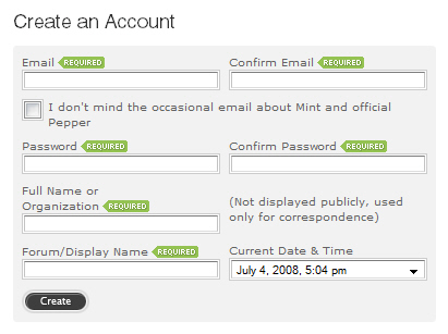
Mint has a sign-up form with horizontally arranged input fields. When the visitors type in the data they eye needs to jump from one field to the other.
Further findings
- 18% have a sign-in form or a link to the sign-in form placed next to it (e.g. YouTube, Reddit, Digg, Lulu, Metacafe);
- 78% do not use asterisks to highlight required input fields; in most cases neither asterisks nor any other form of highlighting is used.
- 9% use a progress indicator to show to the users where they currently are and which steps are required to get the registration done.
- 85% of the sites don’t use legend and fieldset preferring a simple web-form with as few input fields as possible.
- fields are usually grouped and divided by whitespace (69%), borders are also used (22%), different background colors are used in 9% of the cases.
Bottom line
Let’s conclude the first part of the survey results with a brief overview of the main findings of our survey of current web form design patterns. Please keep in mind that we have considered only sign-up forms.
- the registration link is titled “sign up” (40%) and placed in the right upper corner,
- sign-up forms have a simplified layout to avoid distractions for users (61%),
- sign-up forms are one-page-forms (93%),
- sign up forms attract visitors by explaining the benefits of registration (41%),
- titles of the input fields are highlighted bold (62%)
- no trend in the label alignment can be identified,
- designers tend to use few mandatory fields,
- designers tend to use few optional fields,
- vertically arranged fields are preferred to horizontally arranged fields (86%).
Please stay tuned, we’ll present the second part of our findings next week.


