Quotes are used to emphasize excerpts of text. Since users almost never read but scan we need to provide them with some focus anchors to fix their attention to the most important parts of our articles. Furthermore, quotes are always used for testimonials and sometimes for blog comments. They can be styled using graphics, CSS and a little bit of JavaScript. Sometimes, dynamic creative solutions can be applied as well.
This post presents creative examples and best practices for design of pull quotes. We’ve tried to identify some common solutions and interesting approaches you may want to use or develop further in your projects.
You may also want to take a look at the posts:
Aren’t all these quotes the same?
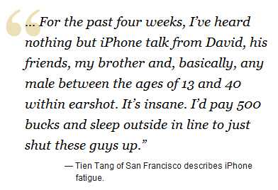
No. First of all: quote ≠ block quote ≠ pull quote. Pull quotes are short excerpts from the presented text. They are used to pull a text passage out of the reader’s flow and give it a more dominant position in the post or the article.

Pull quote included into an article. The pulled out passage is mentioned few blocks further.
Just like a pull quote blockquote (actually block quotations) are also set off from the main text as a distinct paragraph or block. However, they refer to some external citation which isn’t already mentioned in the article. Block quotations are usually placed within the reader’s flow.
Finally, “normal” quotes cite the content found in some other sources and are included to support the content rather than dominate over it.
Blockquote vs. Q vs. Cite
According to HTML specifications, there are three elements which are supposed to semantically mark up quotations, namely <blockquote>, <q> and <cite>. Although all intended to markup quotes, they should be used in different contexts. So when should you use what? HTML Dog provides a nice and compact overview of these elements:
blockquote is a large quotation. The content of a blockquote
element must include block-level elements such as headings, lists, paragraphs
or div’s. This element can also have an optional attribute cite
that specifies the location (in the form of a URI) where the quote has come from. Example:
<blockquote cite=“http://www.htmldog.com/reference/htmltags/blockquote/">

<p>A large quotation. The content of a blockquote element must include block-level elements such as headings, lists, paragraphs or div’s.</p>
 <p>cite can be used to specify the location (in the form of a URI) where the quote has come from.</p>

</blockquote>
<q>
q is a small quotation. The content of this element is an in-line quote. Modern browsers know how to interpret <q> which is why you can style quotations using this HTML-elements via CSS. Example:
<p>Bob said <q>sexy pyjamas</q> but Chris said <q>a kimono</q></p>Although <q> is almost never used, it has some useful properties. For instance, you can specify the appearance of quotes within the <q>-element via CSS. That’s reasonable as different languages use different quotation marks for the same purpose. For instance, these ones:
Q {}
Q { quotes: ‘»’ ‘«’ }
Q { quotes: ‘„’ ‘“’ }
Modern browsers support this way of styling. Of course, Internet Explorer (even in its 8th version) doesn’t support it although it knows <q> pretty well. In particular, since some problems with encoding of quotes can appear sometimes it’s useful to provide numeric values (see below).
According to standards you can even specify the appearance of quotation marks depending on the browser’s language of the user. This is how a W3C-example looks like:
:lang(fr) > Q { quotes: ‘« ’ ‘ »’ }
:lang(de) > Q { quotes: ‘»’ ‘«’ ‘2039’ ‘203A’ }
As lovely as they may be, pull quotes have inherent problems in the way they are placed in the middle of HTML content. To a visual, CSSenabled browser all might seem hunky-dory, but to those browsers that are not CSS-abled and fall back on the plain HTML or to screen readers for visually impaired users, the pull quotes will appear slap bang in the middle of the main content. A quote suddenly appearing between two paragraphs is clearly out of place and will confusingly break the flow.
If you are using pull-quotes, it is wise to provide a little extra information for users who would stumble on this problem. In the XHTMLyou can provide a message, hidden from view with CSS that reads something like “Start of pull-quote” before the quote and then “endquote” after it.You could even have a link similar to the “skip navigation” link, which would offer the user the ability to skip the pull-quote and continue to the main content.
<cite>
cite defines an in-line citation or reference to another source. Example:
<p>And <cite>Bob</cite> said <q>No, I think it’s a banana</q>.</p>Summing up: for large quotes use blockquote, for small quotes use q and for references to another sources cite should be used. In practice, usually only blockquote and q are used.
Gallery of Pull Quotes and Citations
Quotes, braces, lines, dialogue boxes, balloons — there are some paths a designer can take to create a beautiful and memorable quote. Design solutions vary in colors, forms, and sizes. Different techniques produce different result: However, it is important that it is clear to the visitors that the quote is a quote. Otherwise, it becomes easy to keep track on the content.
Keep in mind: pull quotes shouldn’t be used too often, they shouldn’t be too large, and they shouldn’t be included for the wrong purposes. In most cases an ordinary article should have at most 1-2 pull quotes. Otherwise, they lose their appeal, and the article becomes harder to scan.

Take a look at the example above. 99designs uses a block quotation to emphasize what the site is about. However, the text put in the quotes actually isn’t a quotation. We do not know why quotation mark is used in this case. We do know, though, that they shouldn’t be used in this context.
1. Simple indentation
In most cases simple indentation is enough. In this case, the structure of the content makes clear that the intended content is taken out from the main content flow. However, using this approach you need to make sure you have a very intuitive typographic and visual hierarchy and the indentation won’t be misunderstood. Often italics are used to indicate that the content is a quote, and sometimes quotation is centered. The latter technique, however, is used quite rarely.


2. Quotes and indentation
Another standard approach for design of pull quotes is to use the quote itself as a visual element to clearly indicate what the text passage is supposed to stand for. This technique is by far the most popular one and there is a good reason behind it: it unambiguously communicates the meaning of the text block. Surprisingly, the quote visuals are almost always placed on the left of the quote. You may try to experiment with quote on the right, or at the bottom of the passage.


3. Lines and indentation
Standard, most usual and recommended way of designing blockquotes.


4. Quotations highlighted with a color
Frequently designers use indentation together with a variation of color which is applied to the quote. Usually if the layout is dark quotes are presented in colors which are darker than the main content. And if the layout is light the quote is presented in lighter colors. If quotes need to be strongly emphasized vibrant colors are used. For modest highlighting usually slight variations of main colors suffices to indicate the difference between the main content and cited text.

Natalie Jost displays a random quote from the Bible on her blog


5. Pull Quotes
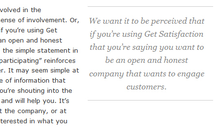
Actually we know it from print where quotes-neighbours are supposed to emphasize some important message or interview excerpts. Pull quotes are placed not within, but next to the content. Such quotes are usually short and don’t provide any additional information as they can also be found in the article. In Web the technique is seen rather rarely, but it has a charm of its own and — if used properly and for the right purposes — may strongly support the content. To clearly separate the “neighbours” from the main content designers often use lines or a large amount of whitespace.
It is important to understand that in such cases pull quotes break the usual content flow which may make it harder for the readers to actually follow the argumentation of the article. In some cases it is more effective to avoid quotes (e.g. if a complex matter is described) while in other cases quotes can quicken and simplify the understanding (e.g. the main statement in the interview).
Quotes-neighbours are usually placed on the right side of the content in order to not break the reader’s flow and remain passive.


6. Creative solutions
Sometimes designers come up with creative solutions one actually wouldn’t expect from such an element as a quote. Here are some of them. Hopefully, they’ll help you to come up with further interesting ideas for the design of pull quotes.


7. Quotations as a standalone element
Often quotations are used and designed not inside an article, but as a standalone design element which is given the dominant position in the design. This is often the case in testimonials where companies present quotes from their customers and clients to confirm the quality they actually promise. In such cases quotations are usually big, bold and clearly visible.
In testimonials quotes are sometimes “rotated” meaning that among 5-7 testimonials only one is displayed at once.


8. Bonus: Footnotes
In books and scientific documents citations are often provided with a footnote reference to the original document. In the Web, where references are commonly just linked to, this technique has never managed to become popular, however footnotes aren’t difficult to achieve with pure CSS.
For instance, if you’d like to cite an excerpt from a book, instead of providing the corresponding title and page number you can simply refer to a footnote below the article. Thus, you can avoid overloading your article with too many references. Footnotes, hence, can make it easier for your readers to read your article and provide details “on-demand” — only when they are needed.
Sometimes footnotes are also used by authors to provide some remarks to the article (similar to books). However, it is not always reasonable to use footnotes for links. The Web is a dynamic medium and links are extremely powerful - you don’t have to send your visitors to the footer of the page first to be able to follow a given link.

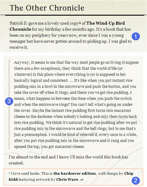
Take a look at the following example. Naz Hamid uses both a blockquote (label 2 in the image above) and a footnote in his articles. The reference to the footnote and the footnote itself are interconnected: visitors can click on the reference and jump to the footnote. And in the footnote the “return”-icon allows the user to jump from the footnote to the place in the article where it is referred to. The author uses the footnotes to provide a personal remark on what has been mentioned in the article (labels 1 and 2).
With footnotes you can offer your visitors some traditional, classic layout feeling without overwhelming them with long references to citations you provide.
Tutorials
- Simple CSS Blockquotes and Pullquotes
- Swooshy Curly Quotes Without Images

- Automatic pullquotes with JavaScript and CSS

- Automatic Pull-quotes with Behaviour and CSS
- Pull Quotes, Article at fonts.com

- Better Pull Quotes: Don’t Repeat Markup

- Snazzy Pullquotes for Your Blog
- HTML Dog: Pull Quotes

- How To Use Pull-quotes
- Making a WordPress Pull Quote

- Footnotes with CSS and Javascript
A XHTML+CSS+Javascript solution for displaying and marking up footnotes. There is also an updated sidenotes version which displays footnotes in the sidebar of a page instead of the footer of the page. Advantages: you don't have to worry about numbering, the footnotes can be edited at their insertion point, you could give users the choice of how footnotes are formatted, or whether they are shown at all.

Further references
- Elements of Design: Pull Quotes Christian Watson showcases 20 examples of attractive, unusual and beautiful pull quotes.
- WordPress Plugin: JavaScript Pull-Quotes A plugin that allows you to easily insert pull-quotes into your posts and pages.It uses client-side JavaScript.
- Grid-Based Design: Six Creative Column Techniques at Smashing Magazine Look at the “Escaping Boundaries” section (fourth from the top). Pull-quotes are an example of a design element that presents an opportunity to break out of your established visual flow.The older version of Andy Rutledge’s Design View used interesting pull-quotes that broke the visual flow of the column.Doing this places greater emphasis on the pull-quotes than if they were kept within the content of the column.


