Compared to conventional navigation patterns tag clouds don’t necessarily offer a more convenient and intuitive navigation. However, used properly, they can provide visitors with an instant illustration of the main topics, giving a very specific and precise orientation of the site’s content. Since human beings tend to think in concepts and models, it’s easier to get an idea of presented content if the main concepts are given straight away — in digestible pieces, and prioritized by their weight. In fact, the main advantage of tag clouds lies in their ability to highlight the most important or/and popular subjects dynamically which is not the case in conventional navigation menus.
Tag clouds offer a quite interesting approach for site navigation; although the technique is sometimes considered to be an “alternative”, it shouldn’t replace the “common” navigation but support it giving users additional clues about the content of the site. Due to their “cloudy” form the design of tag clouds sets them apart from other design elements on a page. And although designers don’t really have that much choice in designing them, they still find their ways to break through the bounds of creativity and come up with some unusual approaches and solutions.
This article offers some selected examples of tag clouds, its shortcomings and also some suggestions for tagging data and links in a more profound and effective way.
Tag Clouds: Are They Here To Stay?
Tagging is the process of labeling data with related keywords. The basic idea of tag clouds is to represent tags according to their meaning, their weight and their frequency relatively to other tags. This is done with appropriate font sizes and colors. The more important a tag is, the bigger and louder it appears (or at least should appear).
Tag clouds are often considered as one of the typical design elements in Web 2.0. However it’s possible that the concept is recently loosing its popularity. Over the last years many sites used the technique, because they wanted to look “smashy”, although they really weren’t. This resulted in unusable and boring designs, supported by the quick’n’dirty-tagging.
Types of Tag Clouds
There is a variety of ways to implement tag clouds. Some methods are more popular than the other ones. Most clouds are primarily sorted alphabetically.
- Tags are sorted alphabetically. The most important or frequent terms are highlighted via an appropriate font size.
- Tags are sorted alphabetically. All terms have the same font size and weight. More important terms are highlighted with a font color or a background color.
- Tags are sorted according to their importance or frequency. Both font-size and colors can be used to emphasize the importance of terms.
- Tags aren’t sorted at all. Font-size, font-weight and colors in use.
- Tags are sorted according to their similarity. Similar terms appear as neighbours next to each other. A variety of visual formatting can be applied.
Your Tags Are Not My Tags
At the first glance tagging might seem like a simple task: you have a data, you describe it, find appropriate keywords, add the labels, done. However, although the tagging itself is extremely powerful, it also has some shortcomings. The problem is that the natural language we use is ambiguous. While labeling data with tags we make use of our personal understanding of this data and these tags. However, keywords are usually not specific enough. To keep a clean and hierarchical structure of tag clouds you need to follow some simple guidelines. Concepts can be described in a variety of ways, but to give the concept the weight it deserves, you need to group similar labels and choose a single tag instead.
- Find the right balance.. If you work in team make sure you have a very precise and unambiguous understanding of how tags are given and how the hierarchy of tags is built. Do you want to be more abstract or more concrete? The more concrete tags you have, the larger your tag clouds become and the less topics are given a higher priority. Do you want to label a set of icons as “icon set”, “icon kit”, “icon” or something more abstract like “freebie”?
- Keep your tags clean.. Make sure you’ve agreed upon the choice of singular/plural and lowercase/uppercase, avoid mistakes and general terms.
Tag Index Instead Of Tag Clouds
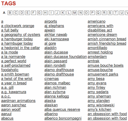
An interesting tendency we’ve been observing recently is the use of tag indexes instead of tag clouds. In some cases tag clouds might be not the best solution for precise content presentation. For instance, if visitors are looking for some specific topic they would prefer a search engine rather than “weighting” proportions of the tags. In such situations a “reference index” of tags comes in handy. In fact, it’s used more and more often — in indexes the tags are sorted alphabetically.


Font-size-weighted Tag Clouds
In many cases tag clouds are placed within a sidebar on the left or the right side of the page; therefore they usually don’t have much site area to fill. Consequently, enormous fonts are used sparingly.


Colorful Tag Clouds
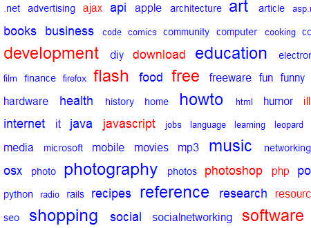
Instead of large font sizes designers tend to use colors. The weight of the tags isn’t only determined by the font-size, but also by the color it has. The more contrast exists between the color of the tag and the background, the more active the tag is. “Passive” tags usually have colors more similar to the background color — they have to remain in the background.
Caution: the more colors are used, the more irritating tag clouds are. Visitors have to be able to gain an immediate understanding of how tag weights are distributed; a variety of colors doesn’t provide any helpful information. What do the used colors stand for? Is green more important than blue? In most cases 2-3 colors should be the maximal number of colors used in a tag cloud.


Form Of Tags in Clouds
Most designers tend to experiment with font-sizes and colors, but you can experiment with background of tags as well. The background has to support the tag it stands for. “Pseudo”-buttons are common.

Shops with Tagclouds
Apparently, online-shops seem to have discovered the usefulness of tag clouds. The design is, however, not always perfect.


Tag Clouds Which Are Not Tag Clouds
Right. Some designers create and label some site elements as tag clouds although they aren’t really tag clouds. Thus site owners try to highlight the main sections of the site manually. Colorful, but neither functional nor useful.


Tagclouds as Startpages
On these web-sites tag cloud is the only design element used on the start page. Extreme tag-o-rama. Frankly, some content would be quite useful.


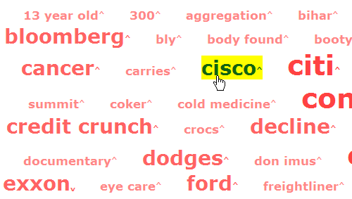
A map of Google News. Take notice of the arrows: they symbolize the development of popularity of the given tag.

Extreme-Tagging on Plurn. And no, it’s not the original screenshot. It was scaled down.

This site is kind of links-directory. The color of the tags stands for the topic the tag belongs to. E.g. pink stands for fashion. Many users might have problems sorting out what is what.
Complete Tagpages
Since tag clouds tend to use large areas of layouts, sometimes they are moved to a single page. There they have much space and designers can risk experiments they wouldn’t risk in a sidebar. Such design solutions are quite rare.


Tagcloud Generators
There is a number of tools which help you to create tag clouds automatically. The main idea behind these services is the analysis of keywords, or most frequent words which appear in a text or on a given web-site. Services listed below enable you to paste a text or let the crawler browse through your web site. That’s enough for static web-sites; dynamic web-sites (driven by CMS or Weblog-engine), however, need a specific plug-in.

Looking For More Ideas?
- Tagclouds Photoset offers a number of tag clouds screenshots as a Flickr stream.
- Collection of tools / sites to create tag clouds


